crispbread 'Shedrye' packaging redesign
The 'Shedrye' crispbread line is widely represented at the federal level, and the current design was developed several years ago. The old packaging was perceived by customers as modest and outdated compared to competitors.
The 'Shedrye' crispbread line is widely represented at the federal level, and the current design was developed several years ago. The old packaging was perceived by customers as modest and outdated compared to competitors.
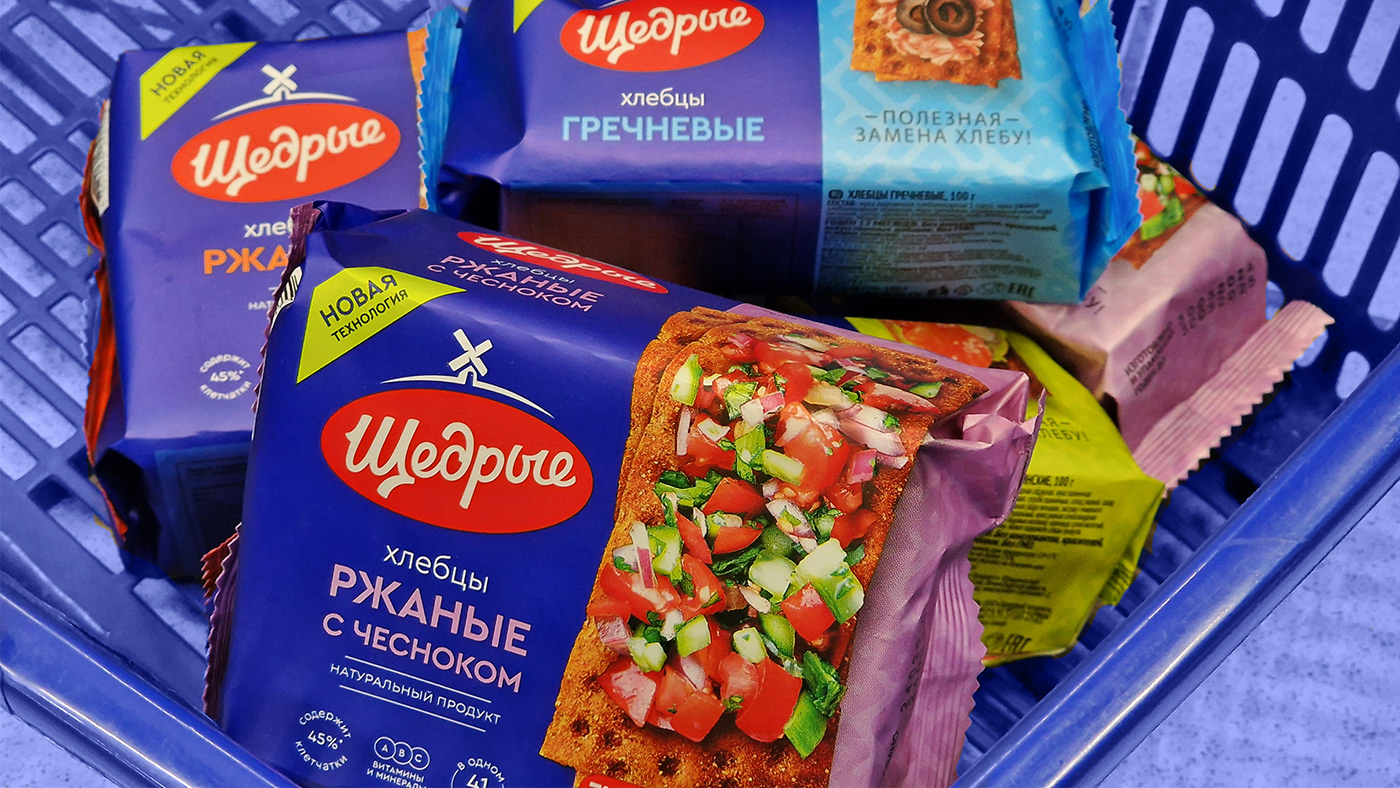
We visually strengthened the brand by dividing the packaging into two zones. Each option underwent consumer tests - this is how we found the best solution, where the left side of the packaging is dedicated to the brand, while the right side serves as a flavor identifier and allows for quicker navigation through the range.
On the colored background, modernized Slavic patterns are featured, merging tradition with contemporary style. This allows us to pay homage to tradition while keeping up with the times.